
ChiLog
A pet health tracking app concept built for speed and clarity
Designed the end-to-end UX and UI for a mobile app concept that helps pet owners log daily health activities in seconds, spot patterns across symptoms and behaviors over time, and walk into vet visits with a clear health summary — built around the insight that most pet tracking tools are either too slow to use daily or too scattered to be useful when it matters.
MY ROLE
Product Designer (solo project)
TOOLS
Figma, Claude Design
Timeline
May 2026 - Present
01
Problem
Problem Statement
Pet owners struggle to consistently track their pet's health (especially for overall healthy dogs) due to high logging friction, scattered information, and lack of sync between caregivers, making it impossible to recall symptoms clearly at vet visits or prevent mistakes like accidental double-dosing.
Pain Points
Logging friction
Most tracking tools require too many steps to record a single entry. The effort outweighs the habit, so owners skip logging altogether, especially for quick observations like bathroom frequency or unusual behavior.
Scattered & unrecallable information
Health data ends up spread across journal apps, chat messages, and memory. At the vet, owners can't answer basic questions — "When did the soft stool start?" or "What food brand is she on?" — because there's no single organized place to look.
Multi-caregiver blind spots
When two people share pet care with no shared system, things fall through the cracks. A medication gets given twice because neither person knew the other already did it.
02
Research
Survey & Interview
To validate that these pain points weren't just personal, I surveyed (Link↗) pet owners across different lifestyles and pet types, key findings includes:
Competitive Analysis

Three gaps no competitor solved:
No app combines quick logging + straightforward info storage + record history
No app visualizes health data as a cross-category chart to let you see how symptoms, bathroom habits, and meals relate to each other for vet visits
Vet visit summary is either absent or paywalled across every app tested
03
Define
Jobs to be Done
To ground design decisions in real user needs, I developed two JBTD based on survey responses and personal experience.
JTBD 1 — The Daily Logger
Based on Maya, freelance designer, 1 dog, shared caregiver
When something happens with my dog — a soft stool, a skipped meal, an unusual behavior — I want to record it instantly without stopping what I'm doing, so I can build an accurate picture of her health over time without relying on memory.
Pain: Current tools require too many steps.
Trigger: Noticing something worth logging in the middle of daily life.
Success: Logged in under 5 seconds, no typing required.
JTBD 2 — The Vet Preparer
Based on Shelly, full-time employee, 2 cats, shared caregiver
When I'm about to go to the vet, I want a clear summary of what's happened since the last visit, so I can answer the vet's questions accurately and not waste the appointment trying to remember details.
Pain: Information is scattered across chat messages, memory, and multiple apps.
Trigger: Vet appointment coming up, realizing she can't recall recent symptoms.
Success: A one-tap summary she can pull up or screenshot in the waiting room.
How Might We
From the research & JTBD analysis, I reframed the pain points as design opportunities:
HMW make logging so fast that owners do it in the moment, not "later"?
HMW help caregivers know instantly whether medication has already been given?
HMW surface health patterns automatically without the owner having to dig through logs?
HMW give owners a clear health snapshot before a vet visit — in one tap?
04
IA & User Flow
Information Architecture
Before sketching screens, I mapped out the full app structure to clarify navigation logic and ensure every feature had a logical home.

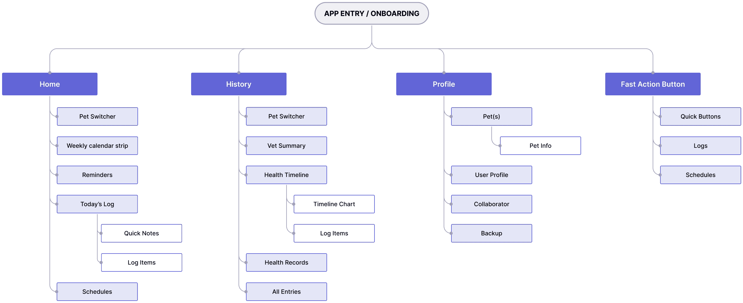
User Flows
I mapped three core flows to validate the IA before moving into wireframes, each targeting a different pain point from the research.
Flow 1 - Log Medication (2 taps)
The fastest possible path for the most high-stakes daily action.


Flow 2 - Log a Poo Entry (3 taps)
Condition are buttons and notes are optional. Soft or abnormal entries can be flagged for the vet summary without creating a separate symptom record.
An optional button to open camera for picture-taking.


Flow 3 — Vet Visit Summary (2 taps)
Summary content is auto-generated from existing logs — no extra input required. Default range is "Since last visit".


05
Design & Dev


06
Prototype Demo
07
Evaluation
What I learned
Less is more.
The hardest design decisions weren’t about adding features, they were about knowing what to leave out. Deciding that diarrhea belongs in Symptoms rather than Poo Condition, or that “Flag this log” is more honest than auto-creating a symptom entry, required understanding the user’s mental model to make the call with confidence.
Data visualization is only useful if it changes behavior.
Early in the process I assumed charts were the answer to making health data useful. It took mapping the actual vet visit scenario to realize that separate charts per category don’t actually help owners spot what matters. The Health Timeline came out of asking: what would actually help Maya answer her vet’s questions? — not what chart type looks good here?
Design decisions compound.
Every structural choice: separating Log from Schedule, making pet context global, and minimum mandatory fields, had downstream effects on every screen that followed. Getting the IA right early made the rest of the design faster and more consistent.
What I’d do differently
If I had more time, I would have conducted usability testing with real pet owners before finalizing the high-fidelity screens. Several decisions like the Flag this log checkbox and the timeline dot system were validated through logic and personal experience, but would benefit from watching someone use them for the first time.
I’d also revisit the Vet Summary structure with actual vets to understand what information they find most useful during a consultation. The current design is built entirely from the owner’s perspective.